Showing posts with label Multiple Division. Show all posts

Tuesday, 20 May 2014

Evaluation of Unit X

At the beginning of Unit X we were given a brief to come up with a presentation representing a trend we had researched and developed. Alice, Sophie and I decided to look further into the problem of overpopulation in today's society. We came up with the name Multiple Division, thus looking into the growth and spreading of things, as a result of overpopulation. We were inspired by the opportunities and areas we could explore from the starting point of this issue. We decided that the most exciting area of all our research was science, we felt as though we could produce refreshing and inspirational images while working with this theme. 
Our aim from the very beginning was to create an inspirational high end resource for creative companies.  Our ambitions were to be innovative and continue to create visually exciting and intriguing imagery.  Continuous research, brainstorming and working together collectively led us to the final outcome. We soon realised our individual skills, from this we worked on separate areas of the book , whether this was illustration , layout or art direction. But continuously coming together to ensure our work flowed and worked as one. Our decisions were always considered, we briskly refined a consistency in our work. This enabled us to maintain a pace and standard of work which we were content with.
Working in a group can be one of the main challenges you face when collaborating, getting your ideas to sync and making sure the workload is evened out but forever maintaining the creativity of the project. Sophie, Alice and I quickly overcame this challenge, we get on extremely well but also have similar ideas and enthusiasm about how to approach a brief like this. We regularly conversed about ideas, supporting and strenthening  each others opinions and visual conception, thus I feel empowered us and was one of our strengths throughout Unit X.
The fundamental challenge we encountered during this project was adjusting to working within a new software, as a group we were determined to build on the skills we had learnt form the workshops. It was extremely exasperating feeling like a beginner. It was difficult to to be creatively productive, being so unsure of how to do this correctly. I enjoyed learning how to use InDesign , but with the short space of time we had to pull the trend book together, I didn't feel we could afford to waste time mastering it.
Before we were able to produce the content of the book, a lot of research was done to contextualise our work and for us to establish the standard of work we wanted to achieve. For me the exploration of the blog 'Federated Unity' was a turning point. The minimalism of the layout allows each image, a lot of which have a twisted nature to them, to speak for themselves. Most of the images in the blog tell a story making you want study them further. I wanted this to be accomplished with our own imagery, constructing a body of work which is innovative, original and contemporary. As talked about previously in the blog we wanted to achieve a book of inspirational imagery, a similar sense to the trend book 'Bloom'. We took inspiration from 'Bloom's' vision which focuses on visual concepts rather than text. Our trend book shadowed this incorporating suggestions of how this could be translated into a trend.
We picked up our trend book from reprographics today, I was extremely happy with it, the pages were of good quality and the images had been printed to a high standard, allowing the colours to be represented correctly. Unfortunately the pages had been printed the wrong way round , which wasn't the original plan. This means the pages don't match up and don't read as a book, due to being so close to deadline we haven't been able to correct this. For next time we have learnt to take the book to reprographics earlier so a test print can be done.
I have thoroughly enjoyed this project and I now feel extremely confident within my practice, I have developed invaluable skills which I can further in future projects. I want to further my knowledge of working with trend books but also involving my practice of digital print for fashion.


Wednesday, 14 May 2014

Magnifying Glass Imagery


We have been planning to do a shoot with the magnifying glass, trying to recreate an image of containment. During our test shoot for Rianna we saw the perfect opportunity to carry it out. Katie was also perfect for the role, in keeping with the minimal and clinical effect we had wanted. These images have been very successful I feel, they also bring something different to the trend book incorporating features but distorting these to add something contemporary and original.  


Monday, 12 May 2014

InDesign Meltdown


And everything was going so well..... We have had a very stressful day today, every possible thing that could've gone wrong has. As a group we are new to indesign and it was very hard to get our head around, we felt the layout wasn't working very well, it was almost too minimal and boring. As we weren't extremely confident with using indesign ,  our abilities were limited thus meaning we weren't able to let our creative skills loose. We felt this was holding our trend book back. Little things were also becoming very frustrating and problematic such as pages not printing out and matching up correctly. Too much time was spent on the logistics of the book rather than the layout and making it look refreshing and exciting. As a group we have decided to go back to photoshop, a software we all feel we can explore fully to create a layout which we feel best represents our trend. 
Learning InDesign has been very fruitful and inspiring, I feel I have a good knowledge of the basics which I can go on to further in third year.

Saturday, 10 May 2014

InDesign Layout Progress


Sophie and I have been working on a layout template in InDesign.  We wanted to create a minimalistic, clean and clinical feel to our book but with a consistency running throughout. As a group we had decided we didn't want the pages to be too busy as we wanted the imagery to speak for itself.  We decided to carry on the idea of the textbook theme so we decided to page the numbers 0.1 onwards. We have had the idea of using symbols in our book to reduce the need for masses of text. Each symbol representing a different key word. Such as environmental, contamination, containment etc. 

Friday, 9 May 2014

Context


In our tutorial Alex talked about context. After creating a series of abstract, art direction focused and stylised imagery, our body of work seems to be directed towards a high end market. A large established creative company could use the book as initial research, before expanding and brainstorming further to create their own innovative and exciting project. 

Friday, 18 April 2014

The Alchemist by Nina van Bart


'In her trend forecast, we become alchemists, mixing minerals, powders and liquids into our own body care products in a quest for the ultimate treasure of wellbeing ' I like the colour palette of these photos and the art direction, the concept of the photos also relate to our science theme. 

Thursday, 17 April 2014

Contamination - Petri Dishes

Fusion of Art and Science
Magical contamination


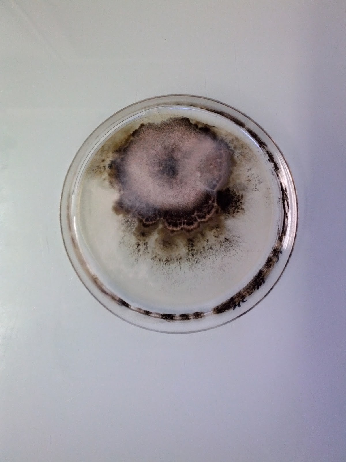
Magical Contamination is a blog which collects images of beautiful and interesting petri dishes. Each dish is made up of different bacterial organisms which have created a number of visually exciting shapes and forms. As a group we talked about experimenting with petri dishes maybe trying to create our own visual outcome. 

Wednesday, 16 April 2014

Kim Keever. Abstract Liquids


New York-based artist Kim Keever experiments with colorful tinted paints and water to create these beautifully abstract, hypnotizing formations. As a former thermal engineer for NASA projects, Keever tends to veer his work towards the scientific and experimental. These images look like an explosion. I like the way Keever has used accessible media to create something magical and large scale. The real life of these images are small scale but Keevers techniques have been able to turn this into something large scale. These images remind me of chemical reactions and contamination, the spreading and multiplying of materials to form structures.

Tuesday, 15 April 2014

Klari Reis


Klari uses the tools and techniques of science in her creative process, constantly experimenting with new ways to apply materials and methods. Klari takes advantage of collaborating with local biomedical companies and receive inspiration from the cutting edge of biological techniques and discoveries. 

Friday, 28 March 2014

Experiments.


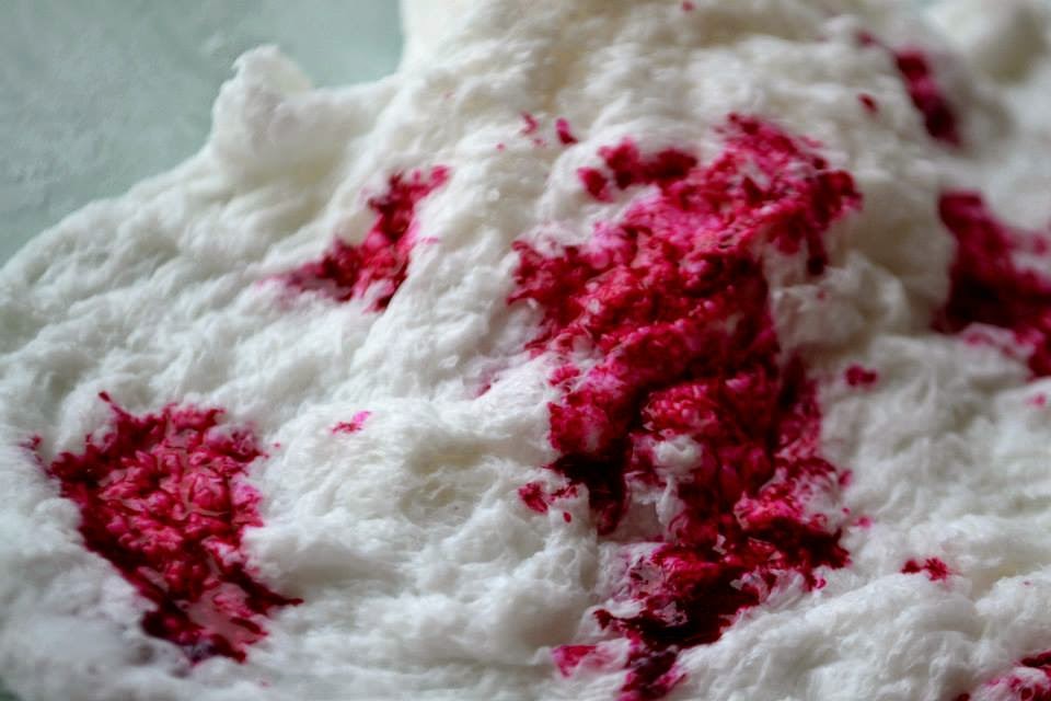
After our tutorial today, we were feeling extremely lost about where our project and trend book was going. We were concentrating heavily on the literal aspect of 'multiple division ' rather than thinking BIG.  So instead of researching the multiple side of the trend we started looking into division, looking at virus, then vaccines, chemical reactions and so looking at science. There was a lot of beautiful imagery when researching science. Alex and Laura told us to try and create our own imagery, so as a group we decided to experiment. We worked with ice creating sharp and intricate structures adding  and dropping colours in as the ice melted. I particularly like the gold and deep fuchsia against the ice white. We also created a 3D form which we made by putting a bar of soap in the microwave. 

Monday, 17 March 2014

Presentation Slides 5 & 6


Slide 5


The underlying question is how will our trend influence design?
More people means more improvement in design, but less resources means that we have to look towrads sustainable fabrics and new technology to keep design progressing. We came across new innovative developments in textiles such as self - healing polymers, which reiterates the idea of viruses spreading and dividing. Catalytic clothing is another development  where it traps polluted air and discoloursthe fabric. Imprioving thew  wearers health and well being. There is also a eletromagnetic hypersensitive fabric that reflects smog.  These are all developments that people do not know about,  but our trend will pin point these new inventions and bring them to light.


Slide 6


We put together examples of how we think our trend could be translated. We felt that aspects we wanted to refer to were elements surrounding layering of fabrics and busy clashing prints. Both layering, hectic busy prints reflect the theme virus; spreading, multiplying and growing.

Presentation Slides 2-4


Slide 1
Our starting point was Overpopulation. World population has doubled in the last 40 years , and there have been numerous problems caused by this. We feel this is a relevent topic, that people all over the world can relate to and be interested in. After brainstroming and researching over population,  we came up with two key words. Multiple , which is the mass of things and Virus which is largely caused by overpopulation  and the spreading of bacteria between people. From these key words we came up with name of 'Multiple Division'. We found this image by Stephanie Jung , which we feel represents out trend and colur palette well.


Slide 3
We looked further into depth, about the effects of  over population and liked the idea of viruses and how they spread. However we didnt want to concentrate solely on the literal aspect so we looked into the aspect of something going 'viral'. Also with the growth of population, there is a growing social media of poeple 'sharing what they are wearing'. This combined can be used to inspire both designers and consumers. 
Slide 2
We explored the concept of overpopulation as a visual outcome, using lack of space, crowding and personal individuality as inspiration. We wanted to illustrate the broadnes of the topic and the many areas that can be explored.


Saturday, 15 March 2014

Wren Viral Campaign

Kissing Campaign

Wren created a fashion film of strangers kissing for the first time, it was artistically shot and had a massive impact on the viewer.  It has enjoyed 23 million views in the three days since it was posted on YouTube. All the women sported the Wren collection, the film was very understated and not many people knew it was a fashion campaign until later research. Thus bringing a lot of attention to the brand. The video was shared on facebook and twitter , which caused it to go viral.


http://youtu.be/IpbDHxCV29A

Thursday, 13 March 2014

Social Media


After attending a number of set lectures and further research into viral campaigns, we realised the importance of social media. One of the lectures was by Stack Magazine, which is an independent magazine distributor. I think the business is a great idea being able to send a random selection of artistic and graphic magazines to customers each month. It is a good way to get peoples ideas out there. It was interest to see the layout the magazines he distributes use. The main thing I took from this lecture was to focus on simplicity, re invent whats already been done and that social media is key.
He gave us a list of the magazine he distributes, I am going to look into these and how they use text and images in their layout. 

 We have set up an Instagram account - @multipledivision. These are all our own imagery which we know reflect our trend,  but we also hope to inspire both creative and consumers. We currently have 40 followers but this is continuing to grow every day. Our next aim is to contact current trend forecasters to gain knowledge on how to take this trend further and hopefully make it go viral. We also have a Facebook group to share our ideas and photos online.


Tuesday, 11 March 2014

Title/First Slides.


For our title we have come up with the name ' Multiple Division'. From looking at previous rends a recurring theme is idea of combining two opposites. Because we are looking at the idea of multiple and virus, we decide to combine multiple and division to portray this.
Together we have come up with a suitable font that we can carry through this whole project. We wanted our slide how to portray the mood and concept of our trend, so each slide has to be consistent. I found an image (first slide) which we felt portrays our trend well , we liked the colour palette so we decided to run with this and make it evident throughout the presentation. We have also linked our interests and created a Facebook group.

http://gb.pinterest.com/davies2870/