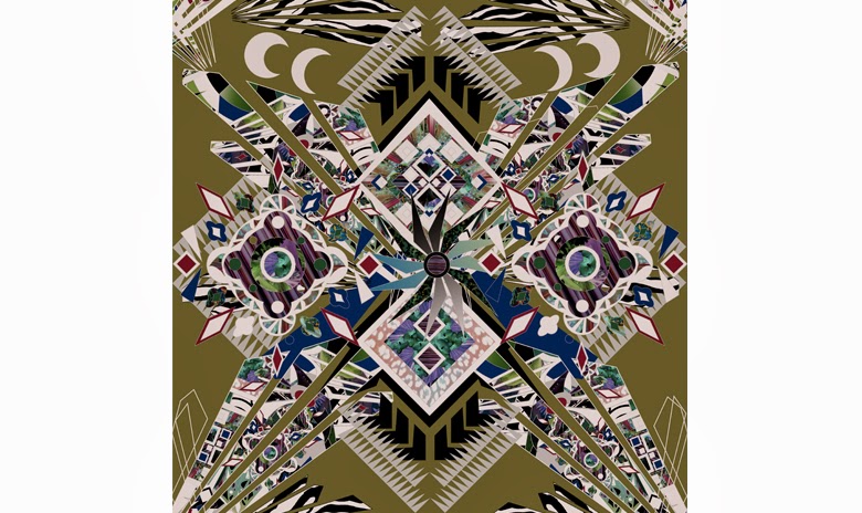
Today we went to the book binding work room and spoke to the tutor, talking through what type of book binding we could use. After looking through these examples we came across the book above. The simplicity of it really inspired us, I liked how it was all about the images and their placement. How images were put together, usually these were contrasting , ie colour and composition. The book also used symbols as a key for certain key words that the images were associated with. We don't want a lot of text in our trend book so I think we could use symbols to make our trend clear to readers.
Showing posts with label Trend Forecasting. Show all posts
Wednesday, 7 May 2014
Glitch Images
In our tutorial Alex had said all of our illustrations and collages had to come from our original images. From this I did a photoshoot concentrating on head shots from different angle. This allowed us as a group to create a surge of interesting and abstract artworks we hoped to inspire creatives. We looked into glitching which worked with the idea of distorting the human figure. After working on our illustrations we wanted to create something as effective but still in keeping the idea of deconstruction and contamination. At the same time also creating something that wasn't as overpowering.
![]() |
| Jil Sander 2011 Campaign |
Tuesday, 6 May 2014
Collage Illustrations
Over the past few days I have been playing around with photoshop, as a group we collectively like the style of collage illustration. I like the cut and paste effect I have created with these two images. I wanted them to be very abstract and not too obvious like my previous attempts. I tried to use contrasting methods such as block shapes against soft, textured backgrounds and darker colours working over lighter soft pastels.
Monday, 5 May 2014
Time Stop.
Containment of Contamination
This images is of milk being dropped into water. It is a very simple idea but very effective. We wanted to show the process of some of our experimentation and so we put the into a sequence. Documenting the change of shape and form of the heavier liquid over time enabled us to see the step by step transition of the experiment.
Friday, 2 May 2014
Containment - Jars
After the test shoot went well Sophie and I photographed the jars in a space where they could be seen to their full potential. This space was perfect, I liked the contrast of the textured concrete wall with hints of black and linear lines adding to the final images. The strip lighting behind the jars created a vibrancy of colour and the contents of the jars seemed to jump out at you . The light enabled us to see the forms and shapes within the jars.
Thursday, 1 May 2014
Containment- test shoot
Sophie and I created a series of compositions within jars, trying to cross over the idea of Contamination | Containment. We filled them with 3D manmade and natural objects such as plants , rope and tubing. we then dropped inks and paints into them, the contrast of colour against the 3D objects created something very inspiring and different. The visual of containing the contaminated has worked especially well and I feel this installation illustrates our idea and concept fully.
Wednesday, 30 April 2014
Contamination | Containment
After more research and group discussion we wanted to bring a contrast into our work. We had been concentrating heavily on the idea of contamination , the multiplying and the spreading of things. Creating our own imagery from experiments. These have been working well but we have decided to further this idea and bring out its best by flipping it on its head and involving a new aspect. Containment. The idea of containing things. Keeping things in a clinical ordered way and teaming this with the messy irrational contamination images.
Furthering on from the idea of having sections in our book called modules. The theme for these modules will now be seperated by the titles of contamination and containment.
Monday, 28 April 2014
MODULE
After further discussion and looking at the work we already had we wanted to move forward with the idea of making our trend book similar to that of a text book. We have many images that we felt needed to be catogerized and so we have decided to create sections within our books that will be called 'Modules'. Each module will have its own title and theme.
Thursday, 20 March 2014
Lisa Stannard. Print Designer.
Lisa Stannard is a textile designer , fashion designer and fashion illustrator. She worked for whitney Eve for 4 years, as eel as interning for Mathew Williamson and showing at trend fairs such as Indigo and Premier Vision. I liked her prints as they were very graphic and busy , she also showed us a cookbook she put together for Whitney Eve. It was good to see how she'd laid it out and how she'd put her own stamp on it.
She made some interesting points about trend forecasting. She said she usually responds to what she sees in everyday life. She also said to follow your intuition and to absorb everything around you. Look at what other creatives are looking at. But also key things to look at were :
- Fashion
- Street style
- Food
- Music
- Film
- Photography
- Literature
Monday, 17 March 2014
Presentation Slides 5 & 6
![]() |
| Slide 5 |
The underlying question is how will our trend influence design?
More people means more improvement in design, but less resources means that we have to look towrads sustainable fabrics and new technology to keep design progressing. We came across new innovative developments in textiles such as self - healing polymers, which reiterates the idea of viruses spreading and dividing. Catalytic clothing is another development where it traps polluted air and discoloursthe fabric. Imprioving thew wearers health and well being. There is also a eletromagnetic hypersensitive fabric that reflects smog. These are all developments that people do not know about, but our trend will pin point these new inventions and bring them to light.
![]() |
| Slide 6 |
We put together examples of how we think our trend could be translated. We felt that aspects we wanted to refer to were elements surrounding layering of fabrics and busy clashing prints. Both layering, hectic busy prints reflect the theme virus; spreading, multiplying and growing.
Tuesday, 11 March 2014
Title/First Slides.
For our title we have come up with the name ' Multiple Division'. From looking at previous rends a recurring theme is idea of combining two opposites. Because we are looking at the idea of multiple and virus, we decide to combine multiple and division to portray this.
Together we have come up with a suitable font that we can carry through this whole project. We wanted our slide how to portray the mood and concept of our trend, so each slide has to be consistent. I found an image (first slide) which we felt portrays our trend well , we liked the colour palette so we decided to run with this and make it evident throughout the presentation. We have also linked our interests and created a Facebook group.
http://gb.pinterest.com/davies2870/
Unit X
Future Intelligence
Briefing
Briefing
Today we were briefed by Alex on Part One of the trend project. We were put in groups, ours being a group of three. We were told to brainstorm and come up with a trend factor that can affect how people interact with design. To investigate what factors inspire and influence design. We are meant to research key issues and develop ideas to create a digitally based presentation. As a group we were interested in looking at Social and Environmental factors, the one that stood out to us most was the problem of overpopulation.
We brainstormed this factor and came up with other issues resulting from this widespread problem. The few that we liked most as a group, was virus, multiple and natural disasters. After the tutorial with Alex we narrowed this down to virus and multiple, we felt these were the most interesting topics that we could create a trend out of and look at how these would affect design. We want to look at multiple - which is linked to overpopulation - the mass of things. Overpopulation and multiple people lead to virus which limits population. We want to look at the theme, Virus, not only literally but the idea of viral marketing, and how fashion companies use technology to make their campaigns viral. Now we have our theme we have to work with coming up with a name and a brief slideshow explaining and trying to inspire others with our trend. We need to decide and focus our trend looking at seasons, financial aspects and aesthetics.
Subscribe to:
Posts (Atom)